Lab 2 • Responsive Web Design
1. What is RWD?
What is the purpose of the RWD? Why it is used? How things are done before RWD? What is the difference?
The purpose of RWD, for Responsive Web Design, is to make web page able to fit with any size of display, whether it is a desktop or a mobile device.
For example, on small devices, like smartphones, elements can be displayed in one large column while on desktop devices it will appear in lines, or display more columns at the same time.
Before responsive design standards, a web page was built for a minimum size of display (for example 800x600px) and if the screen was smaller, then it will crop the web site and use some scrollbars to be able to access the rest of the contents.
It is also the same thing for images, if it was too large, it was either cropped or "scrollable".
But today, elements are placed to fit with the width of the device (and if it is wide, more columns or larger ones are displayed) and the user only need to scroll up and down.
Also, images and icons are scaled to fit the screen whatever the wideness of the device.
How CSS media queries can help you building responsive web sites?
Media queries are sections in CSS files where the developer can put information for specific sizes and type of display (screen as smartphone, tablet, or desktop, or printable page).
Commonly, grids and wrapping are done for most of the contents but for some other elements developer has to specify a maximum width (for large screens) or fit width (for small ones).
Why to use em (font) based sizing for example margins?
Em based sizing is a relative size with respect to the default size specified by the final user. Commonly, 1em is corresponding to 12pt, the default size of a font. Using this unit for margins will use this way and make them proportional with each other and the default size.
Article is already 7 years old, do we have any new technology which can be used to achieve same type of UI responsiveness as described in the article? Buzz words: (CSS Grid, Flexbox)
This article is talking about responsiveness and the ability of the elements to fit the device width. But today, we consider that it is not enough. With HTML5 and CSS3 (from 2014), new values of display are released like grid and flexbox.
Indeed, with grid, developer can display as more elements as possible in one row (commonly 1 on smartphones, and more for desktops depending on the max width) and then wrap it to the next line automatically.
With flexbox, developer can create a layout for its web page, with like top bar, bottom bar, left or right-side bar, and contents. After he can fix the size of some of them, then the other blocks will automatically be resized to fit its own contents and increase its size until next block.
2. RWD examples
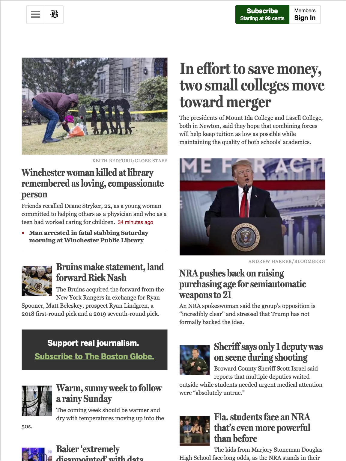
Some examples from this page www.bostonglobe.com:

on iPhone 7
on iPad Air
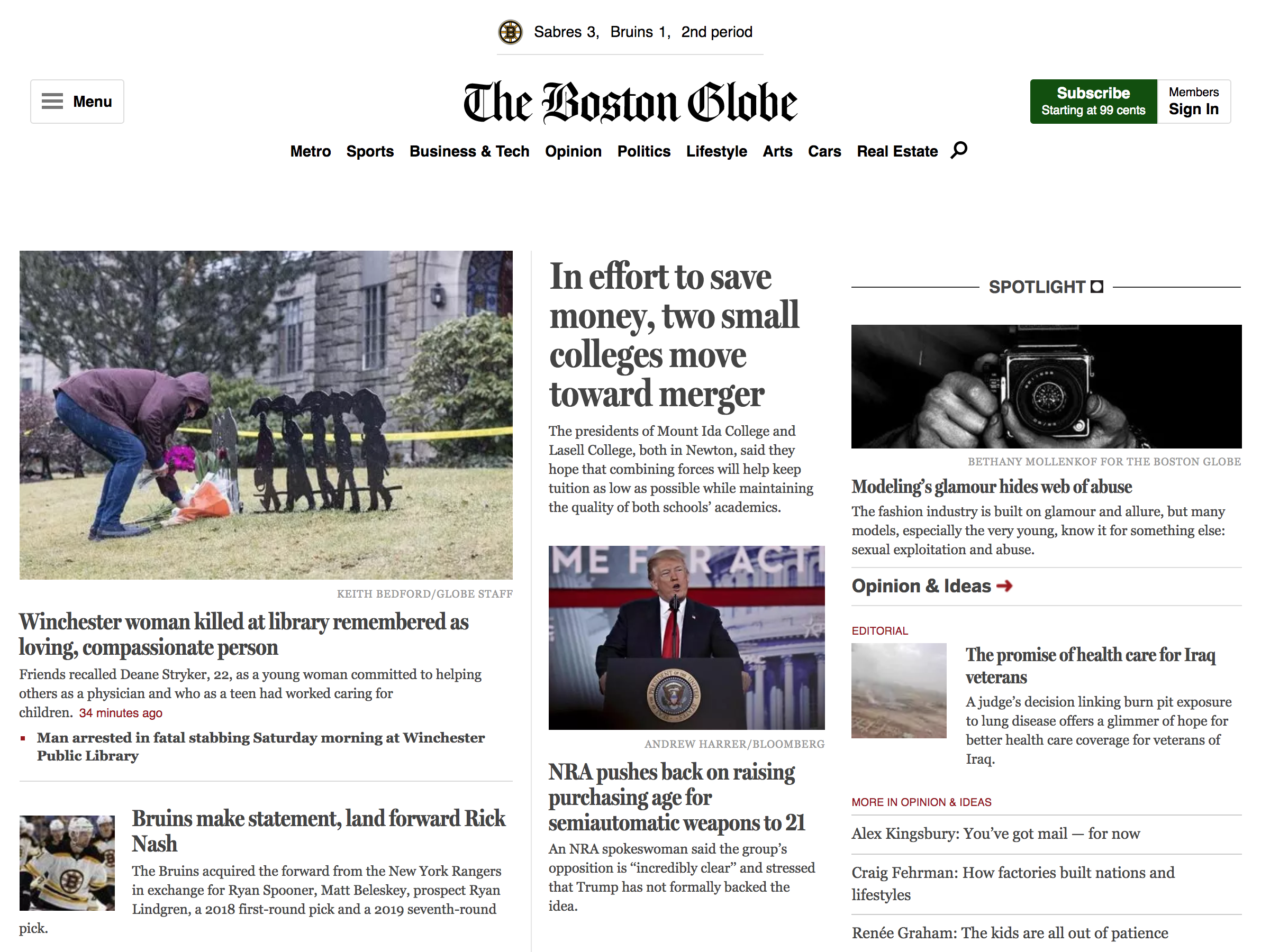
on Macbook 13"
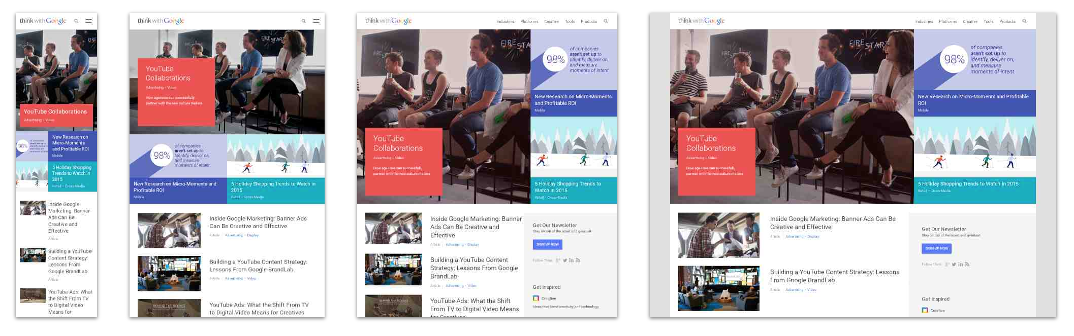
Other examples of responsive websites:
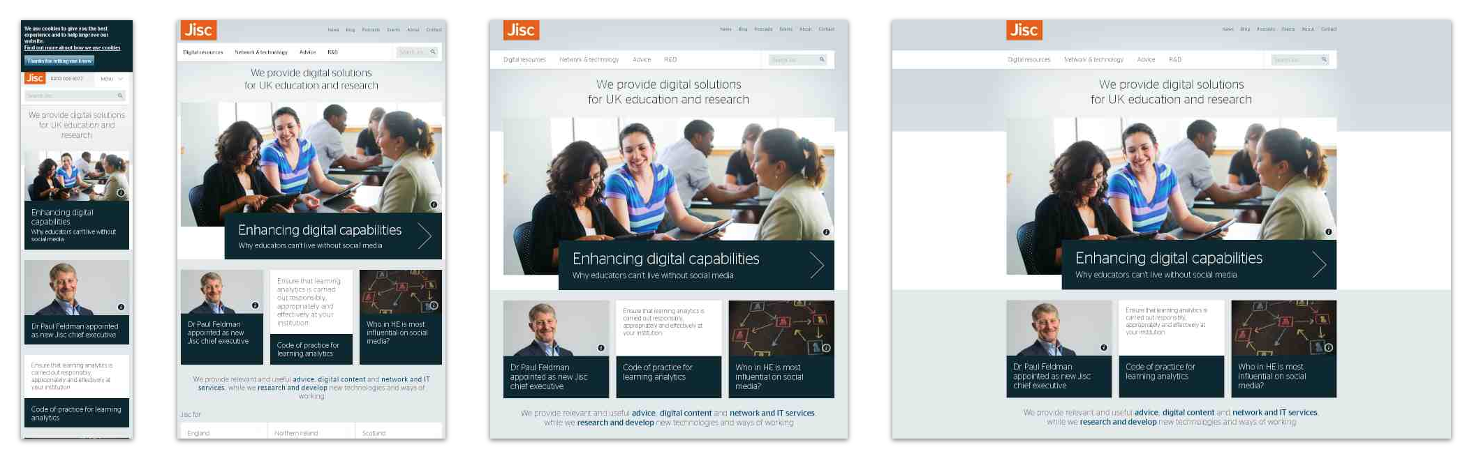
From www.jisc.ac.uk
3. Create a responsive webpage
A webpage similar to a blog and respects responsive standards. It means that the layout is adapted with respect to the client device, and contents based on text are displayed in the same way whatever the device.
4. Make person list responsive
My person list is already responsive.